We always prefer to work with a design team throughout a project but when this isn’t possible we’ll provide as much help as we can. More often than not this entails providing guidelines (for a new website or application) or recommendations (for optimising an existing website or application). These documents have a different purpose.
The aim of our design guidelines is to provide a framework for final screen designs that focus on balancing business and user needs/goals. The aesthetics of the final design is not a driving factor when compiling this document.
The aim of our design recommendations is to target low hanging fruit, or rather low-cost changes to an existing design that make a substantial difference to conversion or completion rates. Again the aesthetics of the design is not the primary focus, usability is.
Industry outsiders are often surprised and somewhat underwhelmed when I’ve shown them previous design (or rather UX) guidelines or recommendations that I’ve supplied in the past.
They always ask, “is that it? That’s so plain!”
I feel a bit sheepish at this point and go on to explain that the final look of the interface isn’t actually where we add value.
I then go on to explain that in actual fact bare-bone wireframes and any supporting text are only a framework or rather creative parameters for the production of the final design.
“So what’s your job then?” is the usual follow-up question.
To which I answer, well we actually focus on helping businesses (direct clients) and agencies (contractors to whom we are a sub-contractor) understand who they are really designing for.
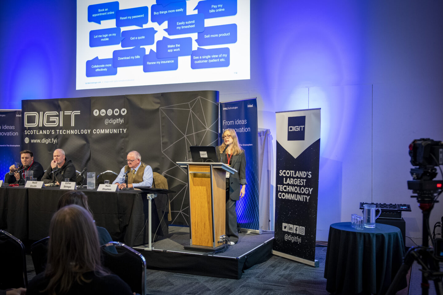
By this I mean we identify what and how people actually interact with an interface before we even consider the final elements of a design.
This is key to everything that follows, as without this we can not measure the efficiency of an interface.
Bottom line people don’t come to your website or use your software to gawp, they’re there to complete a task.
Of course we try to measure satisfaction by asking people how they feel about the design but what really matters is how efficient it is.
So the documents we deliver try to identify what it is your end-users want to do, as well as detailing what they’ve said.
This approach allows us to identify key performance indicators (KPI’s) so that you can measure the effect (through continuous testing) of these changes as well as any future changes you may wish to make.
So to finnish up there are plenty of amazing graphic designers out there (feel free to email me for recommendations) but we aren’t one of them.
Instead we collaborate with a number of talented partners to deliver compelling final designs but each and every one of those goes through this in-house process.
The reason for this is that the end deliverable will:
- be focussed on who is going to use it
- facilitate what the people using it wish to achieve
And hopefully:
- be pleasing on the eye.
In truth though I’d always sacrifice a bit of the latter if it means better performance in terms of completion and conversion rates.